
Controlling the Dissonance
Last month I began writing out my thoughts about my artistic process, and am excited to continue that theme this month (and quite possibly future months).
Do you ever look at a painting and wonder why it works? Like, how does an artist choose that rapturous color palette, that obscure subject matter, that unexpected composition? I feel that way when I listen to music. I know just enough about music to know how little I know, and to appreciate when someone is doing something really hard that I couldn’t begin to attempt. It's probably why I really enjoy the way Jacob Collier translates music for us lesser mortals. One of my favorites, his breakdown of augmented and diminished triads (worth the quick watch!), explains what I learned decades ago in piano lessons but didn’t realize was happening. How these triads communicate visceral feelings in their physical alteration. It’s fascinating. He also talks here about music’s dissonance and consonance. And his summary stopped me in my tracks, because it’s exactly how I think about my paintings:
“Dissonance can be beautiful to the point of devastating…If you control the dissonance, you have way more meaningful harmony than if you just play consonance stuff all the time…the pretty intervals. The reason why music moves us is because of all these little tensions and releases.”
I talked last month about starting each painting in different ways so that I need to problem solve. Put another way, I start with the dissonance. Slapping down colors that don’t initial sound good together allows me to weed through all the intersections and find the juicy ones. Rarely do I paint over all the initial brushstrokes. Rather, I tailor the best parts of the initial fury by adding more layers, augmenting the tones, deepening or diluting the saturations around them. As I go, I’m careful to retain the core of that raw and wild beginning, because if I edit too much, the piece becomes too pretty. “Saccharine,” the art critic might say. Like eating so much candy that all you want is a piece of broccoli.
Art, like life, needs the loose places so that the viewer can breathe, and the tight places to draw them back in.
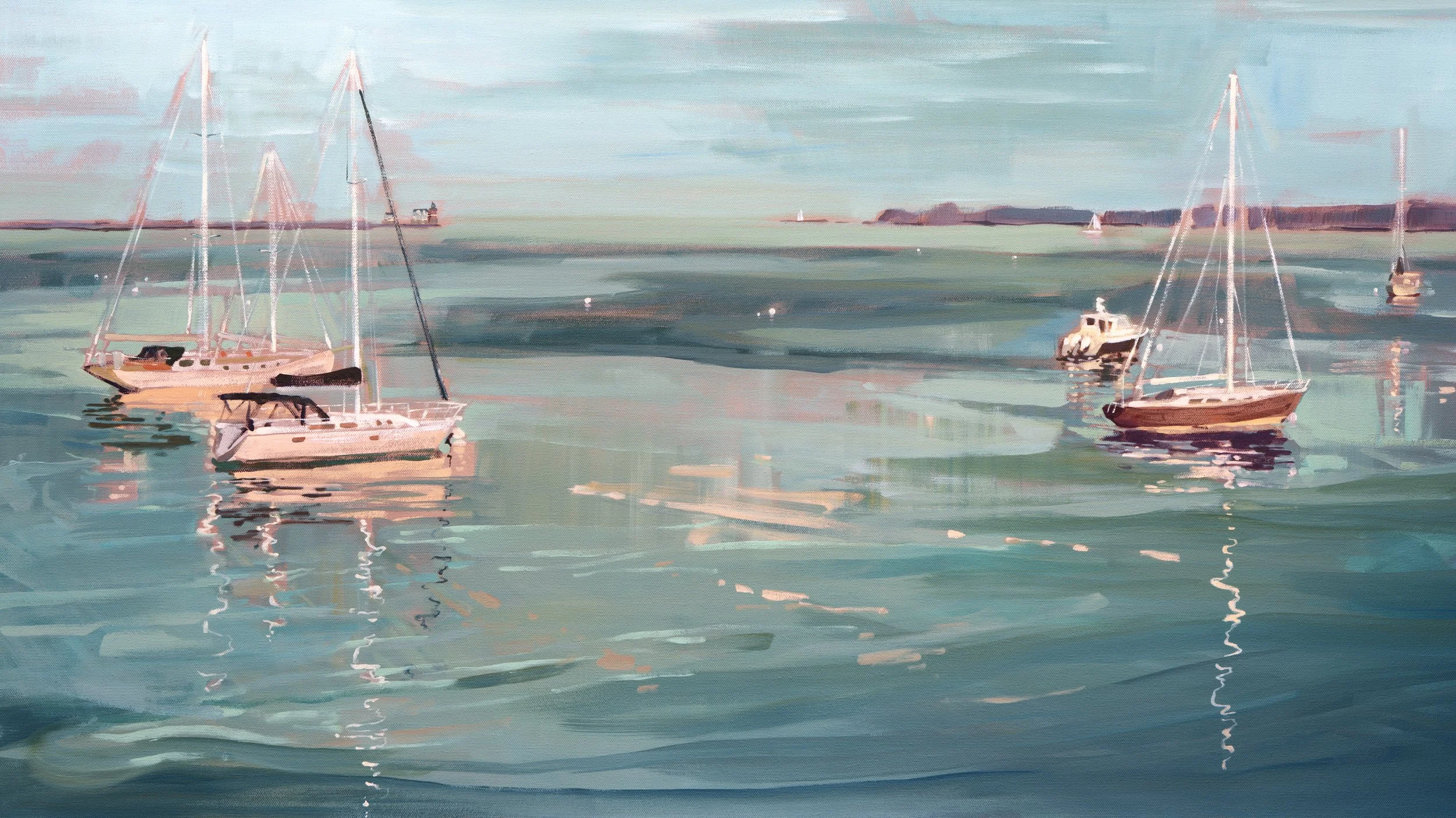
So for fun, I’ve taken a painting I’m working for next month’s collection launch, and analyzed it through this lens. I’m no Collier, but hopefully it illuminates the piece a bit more for you. Thanks for reading along!
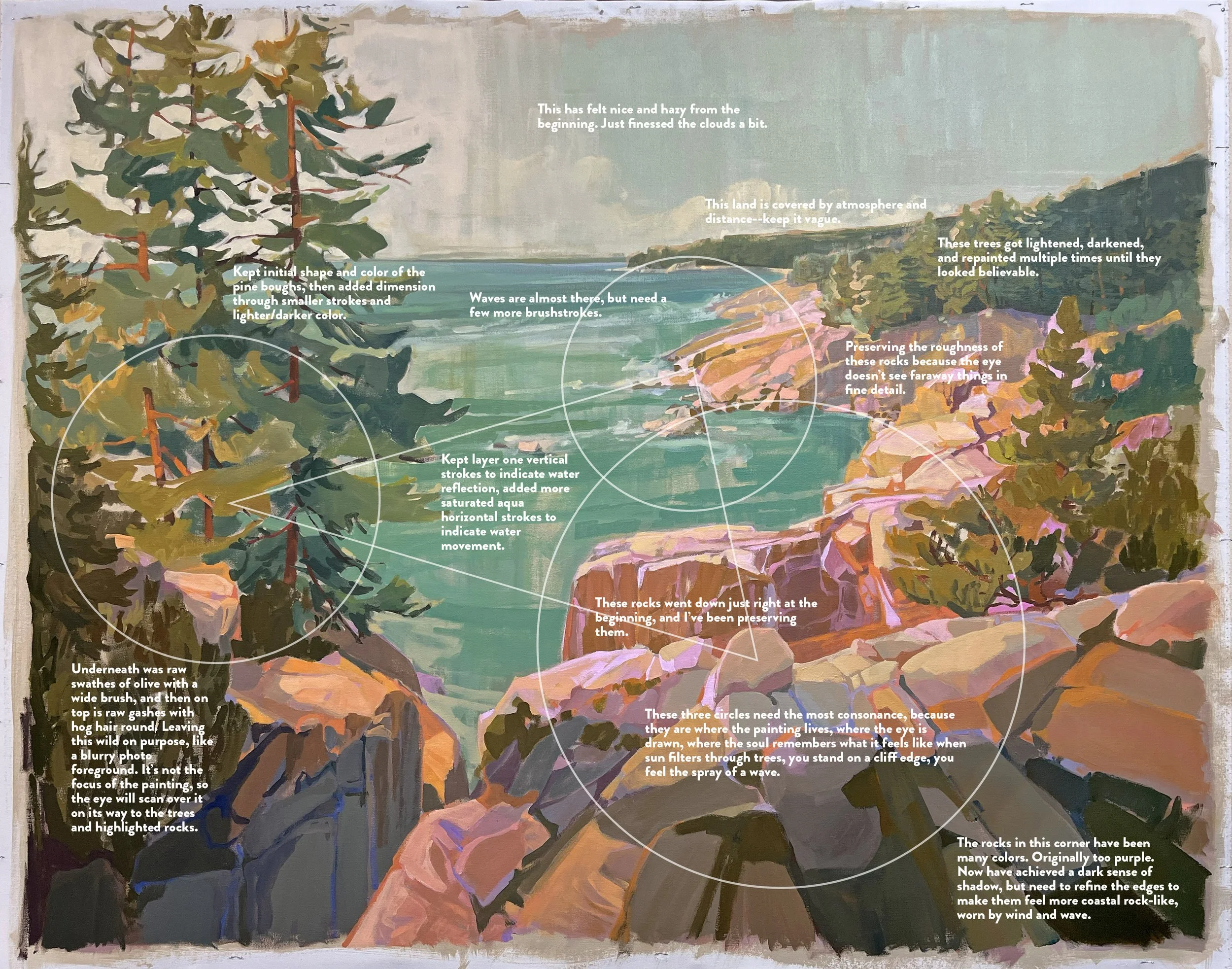
How I think through the tensions and releases of a painting. You may need to zoom to read the text.
On the Website
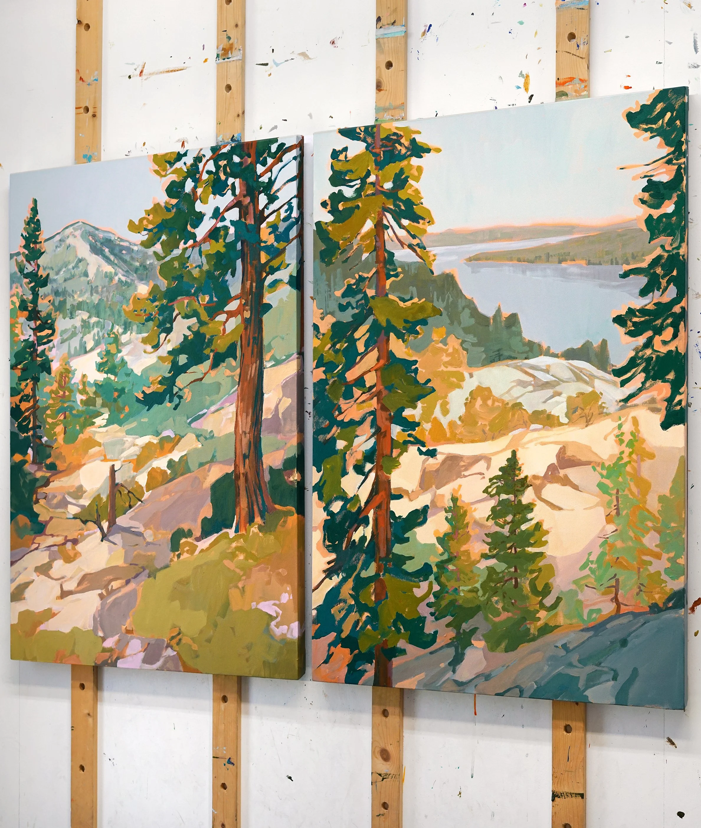
Slow Trails
The new collection is coming together and releases Wednesday, May 6.
Email subscribers will have early access as usual!
Around the Sphere
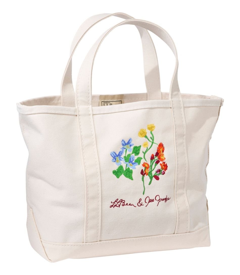
L.L.Bean Boat and Tote
Fifth grade Jess (looking stylin’ with her new L.L.Bean deluxe backpack) would never believe me if I went back and told her about their new Boat and Tote. I’m so excited to see it launched into the world, featuring embroidery from my hand-painted Maine wildflowers that I created just for L.L.Bean. And the zip pouch features them in a beautiful floral pattern. I continue to be grateful to work with brands that value hand-crafted, human art embroidered by other humans!
Samsung Frame TV
Three paintings placed in Minted’s most recent contest, which sourced new artwork exclusively for Samsung’s THE FRAME TV. Just search “Jess Franks” in The Frame’s app.